According to research, we generate 2.5 quintillion bytes of data per day. What data visualisation techniques do you employ to efficiently digest all of that data?
While this is a startling figure, it is only expected to rise as the Internet of Things (IoT) develops. In fact, in the last two years alone, 90 percent of the world’s data was generated!
With so much information at our disposal, it is critical to learn how to arrange it into easily interpretable, meaningful intelligence. However, if you manage many content assets with multiple data sources, determining how to create your analytics strategy can be tricky.
This is when knowing the appropriate data visualisation types to adopt comes in handy.
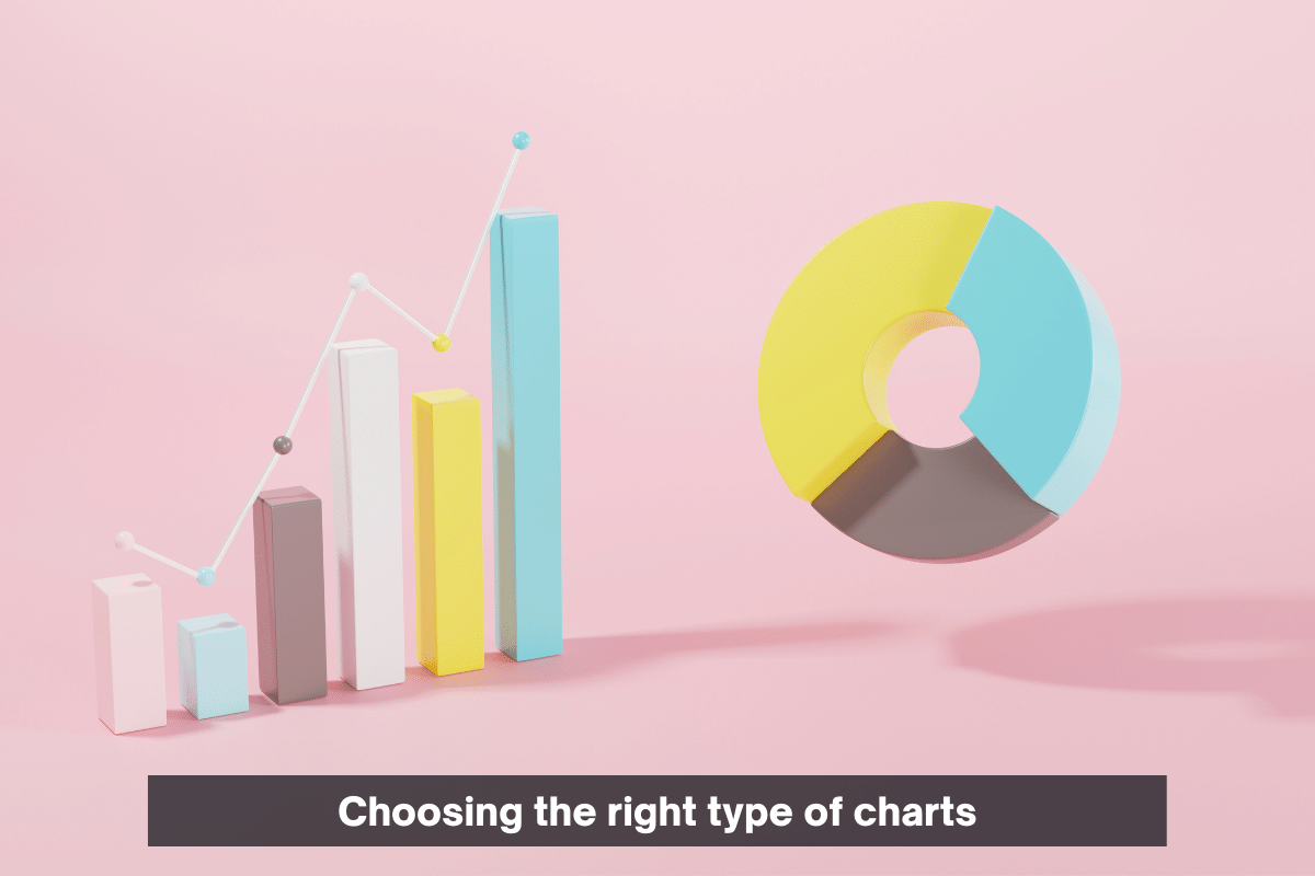
While they all help to speed up and improve data interpretation, not all of them are ideal for the same job. Choosing the correct visual presentation is critical for avoiding user confusion and ensuring the accuracy of your study. The trick is to select the one that best represents the message and narrative of your data.
In this article, we’ve compiled a list of the top three data visualisations. You’ll also discover an overview of each one, as well as suggestions for when to utilise it.
There is a list followed by a discussion of each of the types.
- Bar Graph
- Pie Chart
- Donut Chart
Bar Graph:

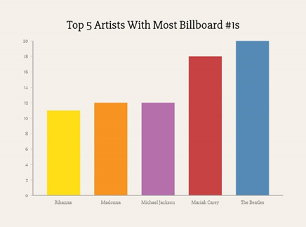
Among the most common data representations on this list is the bar chart or bar graph. They are also referred to as column charts on occasion. Data is compared using bar charts along two axes. One axis is numerical, and the other depicts the categories or themes being measured.
A bar chart with vertical or horizontal bars can be used. Numerical values are displayed on the y axis (vertical axis) in vertical bar graphs and on the x axis in horizontal bar graphs (horizontal axis.)
Examine your data to determine the style of bar graph to use. A horizontal bar chart is the ideal choice if your qualitative data has long, descriptive labels. Another interesting alternative is to employ a visual axis system where you can use a color-coding system and a legend instead of posting the category name next to its associated bar.
Pie Chart:

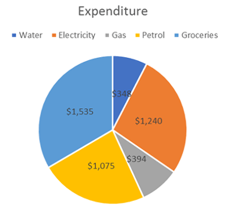
A pie chart depicts a single static statistic that has been divided into categories that make up its various pieces. When you use one, you will express numerical amounts as percentages. When you total together all of the individual pieces, they should equal 100 percent.
These are particularly useful in digital marketing since they can be used to display a breakdown of:
- Market Shares
- Marketing expenses
- Customer Demographics
- Customer Demographics
- Sources of online traffic
You want your pie chart to include a plethora of differentiating features between the slices. As a result, it’s ideal to keep the number of categories you depict to a minimum.
Donut Chart:

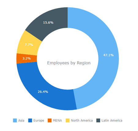
Donut charts are used to display categorical data proportions, with the size of each component indicating the proportion of each category. A donut chart is made by combining a string field with a count of features, number, or rate/ratio fields.
A donut chart is similar to a pie chart; however, it removes the middle area. The distinction between them is primarily visible. A donut chart can include more sections than a pie chart and still be understandable.
The same colour guideline applies to donut charts; pick contrasting colours to clearly distinguish the parts. To make them more appealing, add a 3D element with greater visual depth to the doughnut. Consider adding some animation to the chart if you’re working on a project to share online.
